


Logo design must follow specific guidelines to be effective. This includes the uniqueness of the design, simplicity of design, and the correct file format. The design should also be created first in black and white before being fleshed out with the correct colors.
1- A unique design
The logo must highlight the qualities that make you unique in your industry. You need to define your brand identity to create a logo with a unique design. In finding that brand identity, you need to ask yourself the following questions:
- Why did you start your business?
- What beliefs and values are important to you as a company?
- In what areas can you outperform the competition?
- What terms come to mind if you have to define your business in 3 words?
These questions aim to establish what makes you special as a business. The answers you come up with will serve as a basis to begin the creative process of designing a unique logo. They serve as guidelines for all the ideas you will develop later.
2- Simplicity
A well-designed logo is straightforward in its simplicity. A simple design doesn’t just mean a minimalist design. The simplicity of a design is reflected in its harmony. The logo is created according to the values that are essential to ensuring the brand is recognized by the public and competing companies.
The simplest designs combine efficiency with creativity. They are modern and well organized in their structures. The idea is to convey the brand's slogan clearly through the design. The secret to a simple and impactful design is the same as for a unique logo. You have to understand the brand identity and apply it to the creative process.
The Nike brand logo is the best example of a design that is simple, yet impactful to the public. The shape of the logo represents the flapping of the wings of Nike, the goddess of victory in Greek mythology. Nike chose its logo as a symbol of speed, power and encouragement. It is also about the values transmitted by the brand in its products. The whole is done in a style that is very minimalist in appearance but rich in meaning.
3- A good file format
The logo you create will be used in all the resources and activities associated with your business. It will also be modified over and over again to adapt to the different situations in which it is used. A pixelated logo in JPEG format will not suffice in this case. It will be unreadable after being resized.
It makes more sense to use a vector format to create the logo. This format allows you to change the dimensions of the logo as many times as necessary without the quality being affected. The vector format is also supported by design software such as Adobe Illustrator.
4- Start in black and white
The process of creating a logo follows the same principles as other graphic design tasks. The task should start with a black and white sketch of the logo. A black and white design encourages you to approach logo design with consistency. You are not tempted to make a design that is too complex or too texture-dependent.
The creation of a logo is kind of like working in a laboratory. The more substances you have to manipulate in your experiment, the more complex your task becomes. The experiment is easier to carry out if you are working with only two substances.
The colors represent the substances in the creation of a logo. By starting your work with black and white, you significantly reduce the difficulty of your task. A large number of world-famous brands have limited themselves to black and white for the design of their logo. Nike, Adidas and Louis Vuitton are good examples.
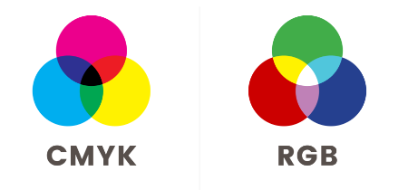
5- Use the right colors
The black and white sketch will act as the foundation for your logo design. Colors complement the design to give it more of an impact on consumers. The reason for choosing logo colors is the same as for the previous guidelines.
The colors must be chosen to enhance the unique features of the brand. The Microsoft logo is a good example. The four colors of this logo represent the four main products of the company.
It’s important to remember that the colors should never be chosen randomly.
6- Define the style and shape of your logo
Style and shape are things that should not be overlooked, as they allow your future prospects to get to know your industry directly. In terms of shapes, you can choose simple basic shapes: a circle, square, triangle, star, etc. Each of these usually has its own meaning. For example, the circle is associated with continuity, the star is associated with eternity, and so on.
At the site level, it is quite possible to combine several forms. For instance, the Arlington Pediatrics logo features two characters that directly refer to a parent and a child. At first glance, therefore, we realize that this is a pediatric center.
7- Use a good typeface
Of course, originality is in order. But you should also avoid becoming tacky. It is strongly recommended not to use unreadable fonts. At the same time, you should avoid using too basic a font, even if simplicity is your goal.
Your best bet would always be to choose an elegant font that isn’t commonly used. To make you stand out completely, you can customize the font to give each character a personal touch.
Conclusion
Creating a logo that can define your brand identity is no easy task. It requires creativity and a good understanding of your brand’s personality.
To make your job easier and ensure you have a professional logo, you can ask Repro-Net.com to create a personalized logo for your company. Contact us now for a quote!